
Introduction
Creating responsive and flexible layouts is a crucial part of modern web design. CSS offers two powerful layout systems: Flexbox and Grid. Both provide efficient ways to structure web pages without relying on float-based designs. In this blog, we’ll explore what Flexbox and Grid are, how they work, and when to use each.
What is CSS Flexbox?
CSS Flexbox (Flexible Box Layout) is designed for arranging elements in a one-dimensional layout—either in a row or a column. It is ideal for aligning and distributing space within a container.
Basic Flexbox Properties
display: flex; /* Enables Flexbox */
justify-content: center; /* Aligns items horizontally */
align-items: center; /* Aligns items vertically */
flex-wrap: wrap; /* Wraps items to a new row if needed */
Example of a Flexbox Layout
.container {
    display: flex;
    justify-content: space-between;
    align-items: center;
}
<div class="container">
<div class="box">Item 1</div>
<div class="box">Item 2</div>
<div class="box">Item 3</div>
</div>What is CSS Grid?
CSS Grid Layout is a powerful system for designing two-dimensional layouts (both rows and columns). It provides more control over complex layouts than Flexbox.
Basic Grid Properties
display: grid; /* Enables Grid */
grid-template-columns: repeat(3, 1fr); /* Creates three equal columns */
grid-gap: 10px; /* Adds spacing between grid items */
Example of a Grid Layout
.grid-container {
    display: grid;
    grid-template-columns: repeat(3, 1fr);
    gap: 20px;
}
<div class="grid-container">
<div class="item">Box 1</div>
<div class="item">Box 2</div>
<div class="item">Box 3</div>
</div>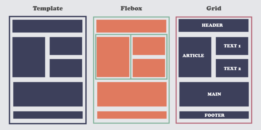
Flexbox vs. Grid: When to Use Them?
| Feature | Flexbox | Grid |
|---|---|---|
| Layout Type | One-dimensional (Row or Column) | Two-dimensional (Rows & Columns) |
| Best for | Aligning elements, navigation bars, small components | Full-page layouts, complex designs |
| Alignment Control | Great for distributing space dynamically | Precise control over grid placement |
Conclusion
Both Flexbox and Grid are essential tools for responsive web design. Flexbox excels in handling one-dimensional layouts, while Grid provides greater flexibility for complex, two-dimensional layouts. Mastering both techniques will help you create efficient, modern web designs with ease.
SEO-Friendly Tags
#CSSFlexbox #CSSGrid #WebDesign #ResponsiveDesign #FrontendDevelopment #CSSLayouts #FlexboxVsGrid #LearnCSS #ModernWebDesign


