
Introduction
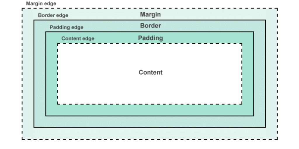
The CSS Box Model is a fundamental concept in web design that defines how elements are structured and spaced on a webpage. Every HTML element is represented as a rectangular box consisting of four key components: content, padding, border, and margin. Understanding how these properties work together helps create well-structured, visually appealing web layouts.
What is the CSS Box Model?
The CSS Box Model describes how elements are displayed and how their dimensions (width and height) are calculated. Each element consists of the following layers:
- Content – The actual text, image, or other media inside the element.
- Padding – The space between the content and the border.
- Border – The edge that surrounds the padding and content.
- Margin – The space between the element and other elements on the page.
Breakdown of Box Model Properties
1. Content
The content area holds the actual text, images, or other elements. The size of this area is determined by the width and height properties.
div {
    width: 200px;
    height: 100px;
    background-color: lightblue;
}
2. Padding
Padding is the space between the content and the border. It can be set equally or individually for each side using:
div {
    padding: 10px; /* Equal padding on all sides */
    padding: 10px 20px 15px 5px; /* Top, Right, Bottom, Left */
}
3. Border
The border surrounds the content and padding. It can be customized using different styles, thicknesses, and colors.
div {
    border: 2px solid black; /* Solid border */
    border-radius: 10px; /* Rounded corners */
}
4. Margin
The margin defines the space between an element and surrounding elements. Like padding, margins can be adjusted individually or uniformly.
div {
    margin: 20px; /* Equal margin on all sides */
    margin: 10px 15px 5px 0; /* Top, Right, Bottom, Left */
}
How the Box Model Affects Layout
✔ Understanding spacing – Helps avoid overlapping and ensures a clean layout.
✔ Better control over element positioning – Allows precise alignment of page components.
✔ Responsive design improvements – Ensures consistent spacing across different screen sizes.
Example: Full Box Model Calculation
If an element has:
width: 200px;padding: 10px;border: 5px solid;margin: 15px;
The total width of the element will be:
200px (content) + 10px (left padding) + 10px (right padding)
+ 5px (left border) + 5px (right border) + 15px (left margin) + 15px (right margin)
= 260px
Conclusion
Mastering the CSS Box Model is essential for designing well-structured layouts. By properly adjusting margins, borders, padding, and content, developers can create visually appealing and responsive web pages. Understanding how these properties interact ensures greater control over element positioning and layout consistency.
SEO-Friendly Tags
#CSSBoxModel #WebDesign #CSSBasics #FrontEndDevelopment #Margins #Padding #Borders #WebDevelopment #ResponsiveDesign #LearnCSS


