

Introduction
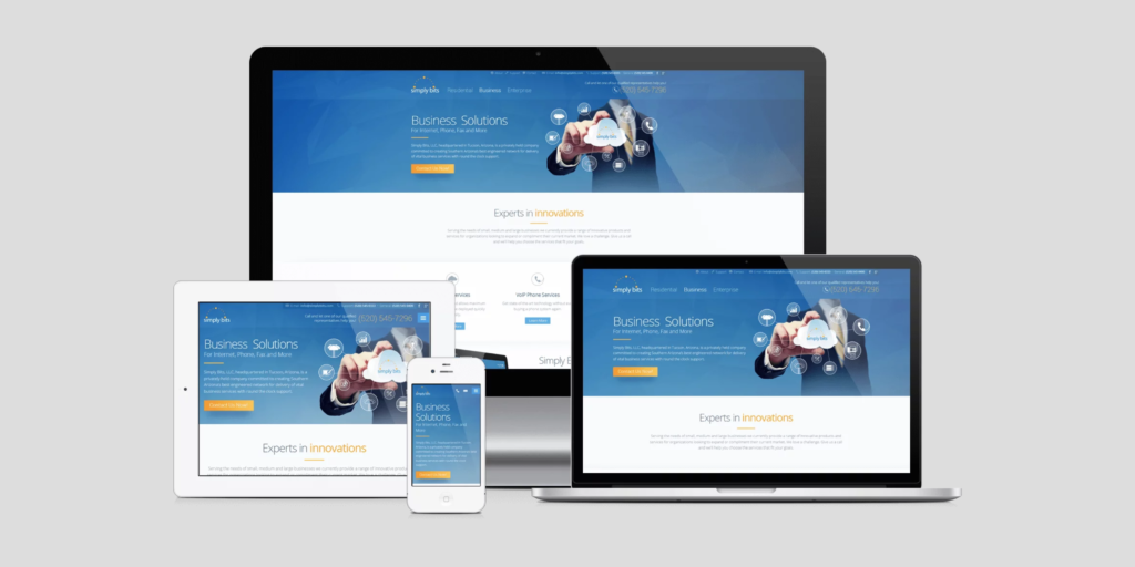
In today’s digital world, users access websites from various devices, including desktops, tablets, and smartphones. To ensure a seamless experience across all screen sizes, web developers use CSS Media Queries. This powerful feature allows websites to adapt dynamically based on the device’s screen width, height, or resolution.
What Are Media Queries?
Media Queries are a CSS technique that applies styles based on a device’s characteristics, such as width, height, orientation, or resolution. They help create responsive designs by modifying layout and styles for different screen sizes.
Basic Syntax of a Media Query
@media (condition) {
    /* CSS rules here */
}
For example, applying styles only when the screen width is 600px or smaller:
@media (max-width: 600px) {
    body {
        background-color: lightgray;
    }
}
Common Media Query Breakpoints
Here are commonly used breakpoints for different devices:
| Device Type | Screen Width |
|---|---|
| Extra Small (Mobile) | max-width: 480px |
| Small (Tablets) | max-width: 768px |
| Medium (Laptops) | max-width: 1024px |
| Large (Desktops) | max-width: 1200px |
Example: Responsive Layout Using Media Queries
.container {
    width: 80%;
    margin: auto;
}

@media (max-width: 768px) {
    .container {
        width: 100%;
    }
}
This ensures the container takes full width on smaller screens.
Using Media Queries for Mobile-Friendly Navigation
.navbar {
    display: flex;
}
@media (max-width: 768px) {
    .navbar {
        flex-direction: column;
    }
}
This changes a horizontal navbar into a vertical menu on mobile devices.
Best Practices for Responsive Design
✔ Use Relative Units – Instead of fixed px, use %, em, or rem for flexible layouts.
✔ Optimize Images – Use CSS properties like max-width: 100% to ensure images scale properly.
✔ Test Across Devices – Use developer tools or online tools like Google’s Mobile-Friendly Test.
✔ Mobile-First Approach – Start designing for mobile screens and progressively enhance for larger screens.
Conclusion
Media Queries are a vital tool for creating responsive web designs that provide an optimal user experience across all devices. By implementing flexible layouts and adaptive styling, developers can ensure their websites perform well in today’s multi-device world.


